
05 / Refinement
The Toggle Button
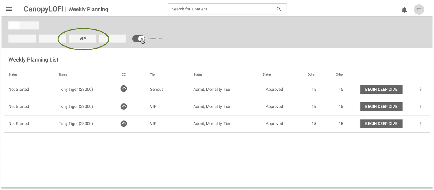
Problem: It was confusing what was actually being switched “on” so we needed a way to create more clarity
Solution: To combat this, I changed the structure of the page. I added “Case Collaboration” as a new page filter instead of a toggle within the existing page.
Design Reasoning: This solution provided more clarity and uniformity from a systemic level

The “Before” solution with confusing toggle button

The “After” Solution
Refining CC Filters
Problem: It was confusing to refine the tier level (not all CC patients are VIP — some are serious or good); some patients are in-active, but still appear on the list
Solution: Restructure the toggle to be an overall page filter (see problem 1 above), then remove tier as a tab, but instead have it within “More Filters” tab.
Reasoning: This was a way to consolidate the tabs into more over-arching categories, such as: View, Provider, Center instead of having more minor details be a complete tab (ie: tier status).
This is the “before” with the VIP as a tab with back-end logic to not show in-active patients

This is the “after” with tab restructure + tier in a “more options” tab
Skills
✔️ User Feedback Analysis
✔️ Attention to Detail