
Chic + Trendy | Dr. Rae
BRAND IDENTITY
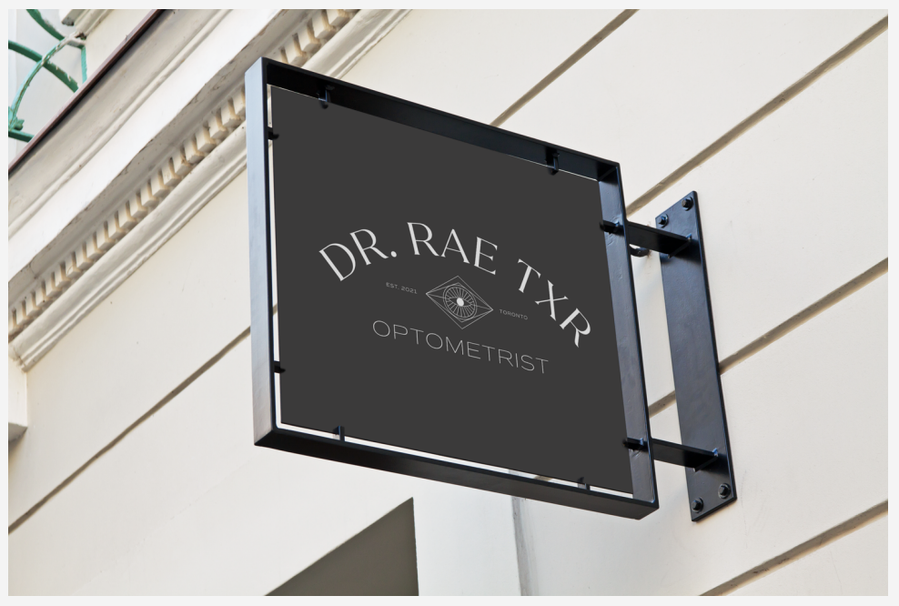
Dr. Rae Teixeira wanted a brand for her optometrist business that captured her young, eloquent + holistic approach will still being professional and taken seriously


PROBLEM:
Rae is a busy gal - she didn’t have time to DIY her own brand
She knew what she wanted but it was out of her wheelhouse
She wanted to incorporate “third eye” concepts without being too “woo woo”
SOLUTION:
We designed a brand that is minimalistic yet classy - it has odes to the spiritual world yet is still professional
We took the concept of “third eye” yet toned it down from the trippy classic third eye visuals.
We used a chic font inspired by high fashion and Paris.
For this project, we were aiming for: authentic, vintage, eloquent, vibey, stylized, holistic, educational, trendy