Minimalistic + Beachy | BossFit
BRAND IDENTITY
BossFit needed a rebrand for their newly redesigned gym. They wanted it to feel global while still having a soft, contrast to represent their tight knit-community. How do we combine all these elements while still keeping it super simple and not cheesy?


PROBLEM:
Wanted it to look simple but not like Arial - too simple
Incorporate the beach but not in a cheesy way
SOLUTION:
We created a sun to play on the beach, but also touch on the idea of circle, community, continual growth
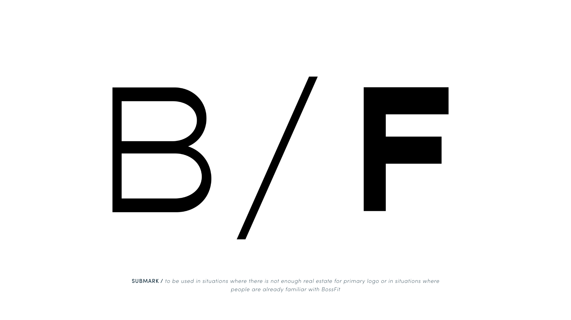
We used a clean font but one with personality - it’s so subtle - an outside eye might not be able to identify what it is exactly, but they will feel something different when they look at it
