
Powerful + Personal | MaryBeth LaRue
BRAND IDENTITY | WEBSITE | INSTAGRAM POSTS
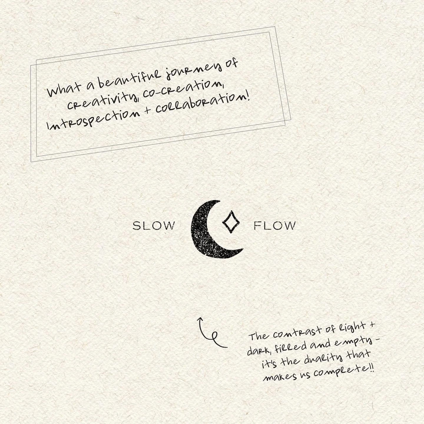
MaryBeth Ra Lue is a well-established yoga teacher and thought-leader in the yoga community. She has a signature embodied and heart-felt style. She wanted a rebrand that looked like someone was peering into her journal; her deepest self - wild, messy, detailed, passionate - perfectly, imperfect.


PROBLEM:
She felt like everything looked too much like a template - it didn’t feel like “her”
She tried to DIY but didn’t have the level of expertise to get what she wanted from her mind translated into a brand + website
SOLUTION:
We listened to her, AND LISTENED, and REALLY FREAKIN LISTENED. Not just for the normal reasons, but to understand her: thoughts, dreams, desires - thought-process, view on the world. Read through her IG posts, watched her youtube videos, read her blogs - we needed to get into her brain if we wanted to execute this right.
With that level of empathy, the design was a BREEZE. We create a scrapbook feel with lots of layers, textures, neutral / earth tones yet still used white space to avoid feeling of overwhelm and an openness to breath + process.
Yet - something was still missing. Ahahhh! For a cherry on top - we turned her beloved handwriting into a custom font. This way, it was not just her words on paper, but seen from an extension of her personal being. Her signature, her style. Her writings and her handwriting - personal on every level.